Jazz Winnipeg Rebrand
Project Brief
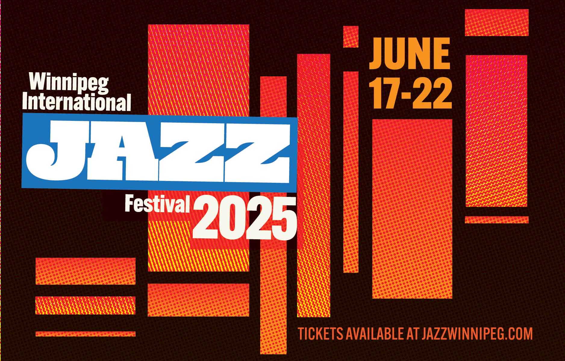
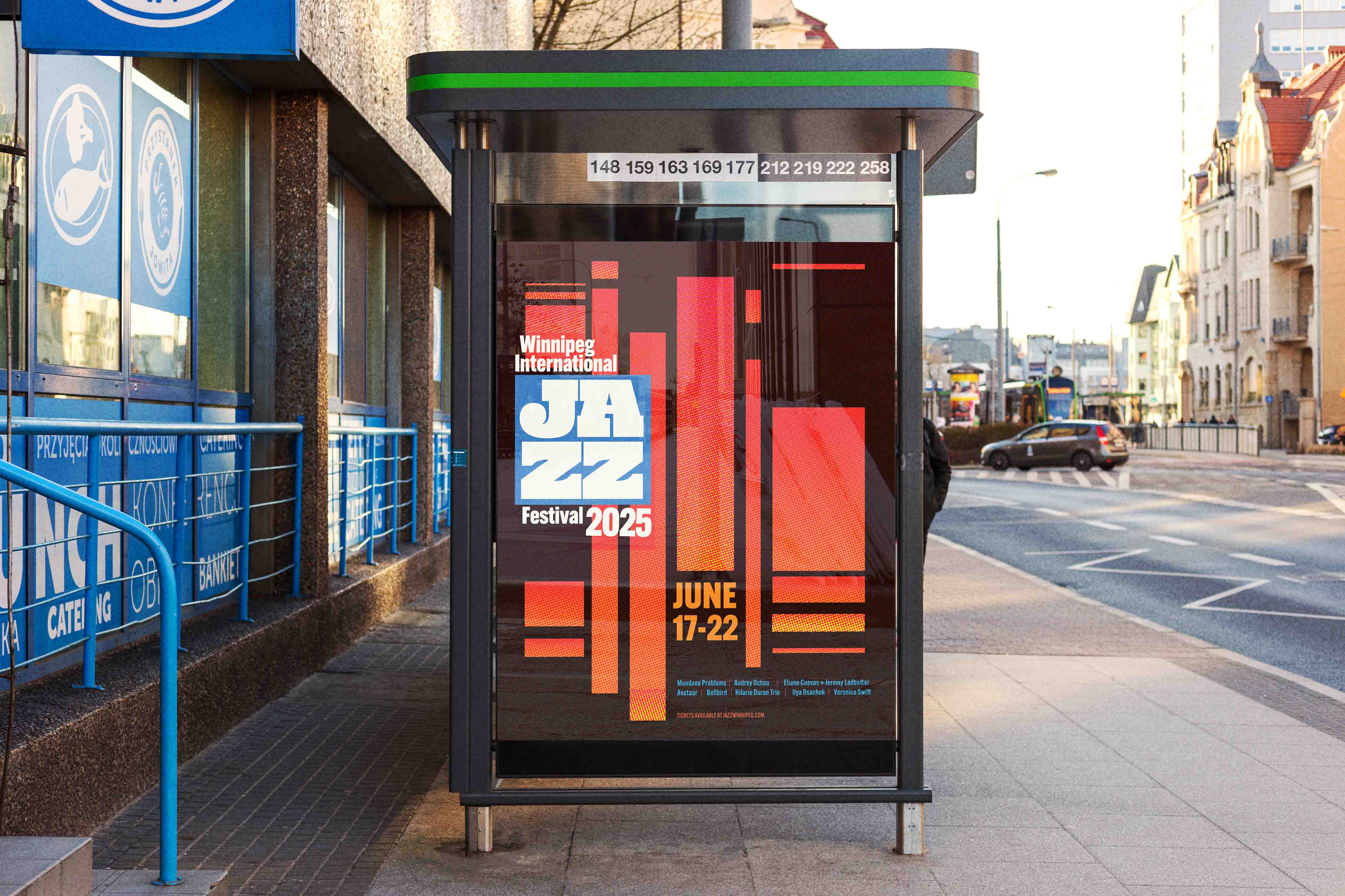
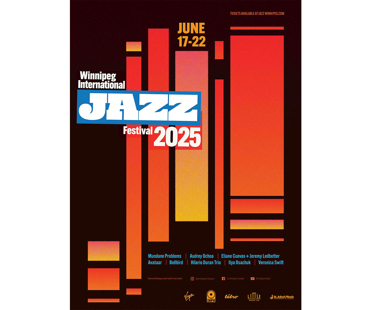
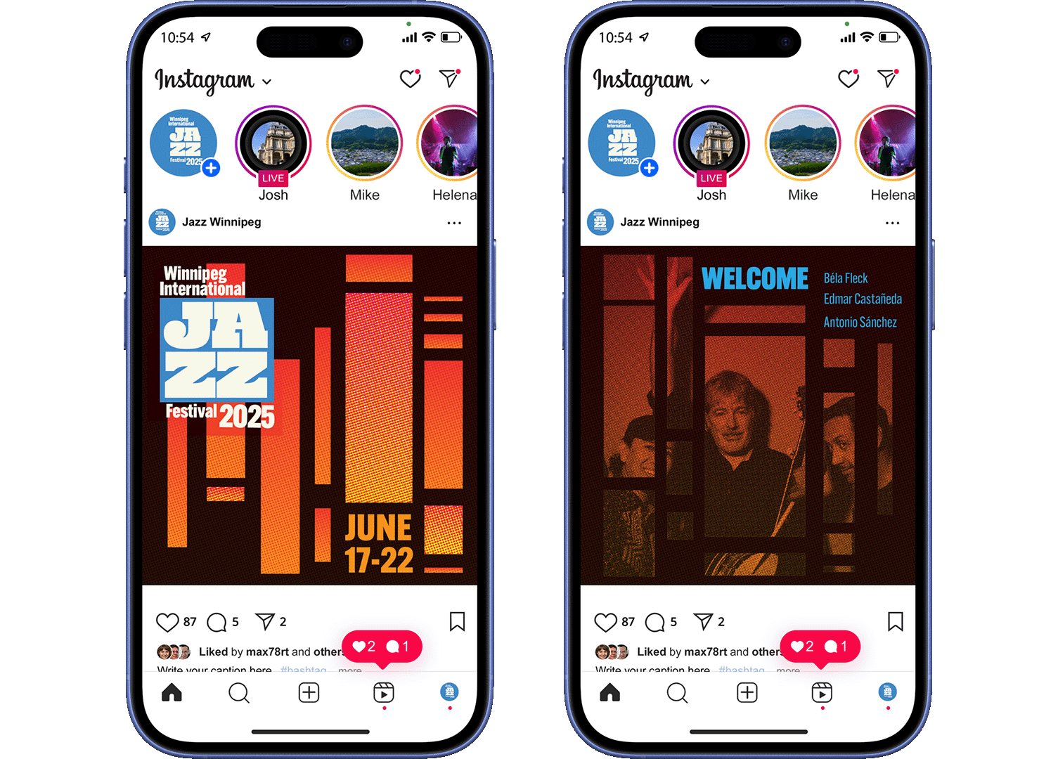
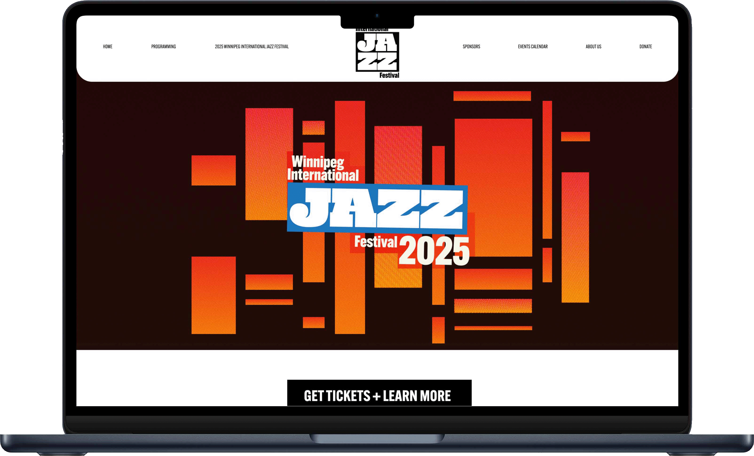
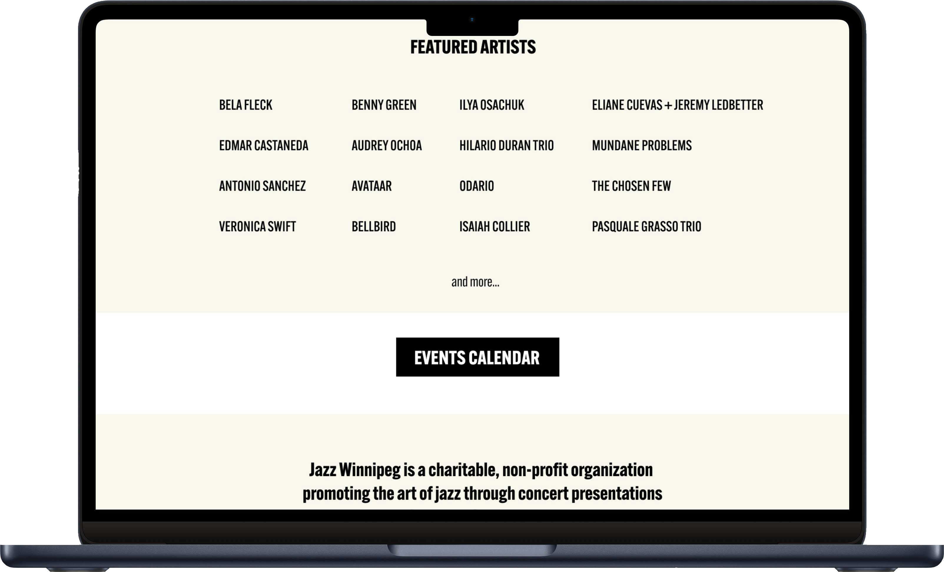
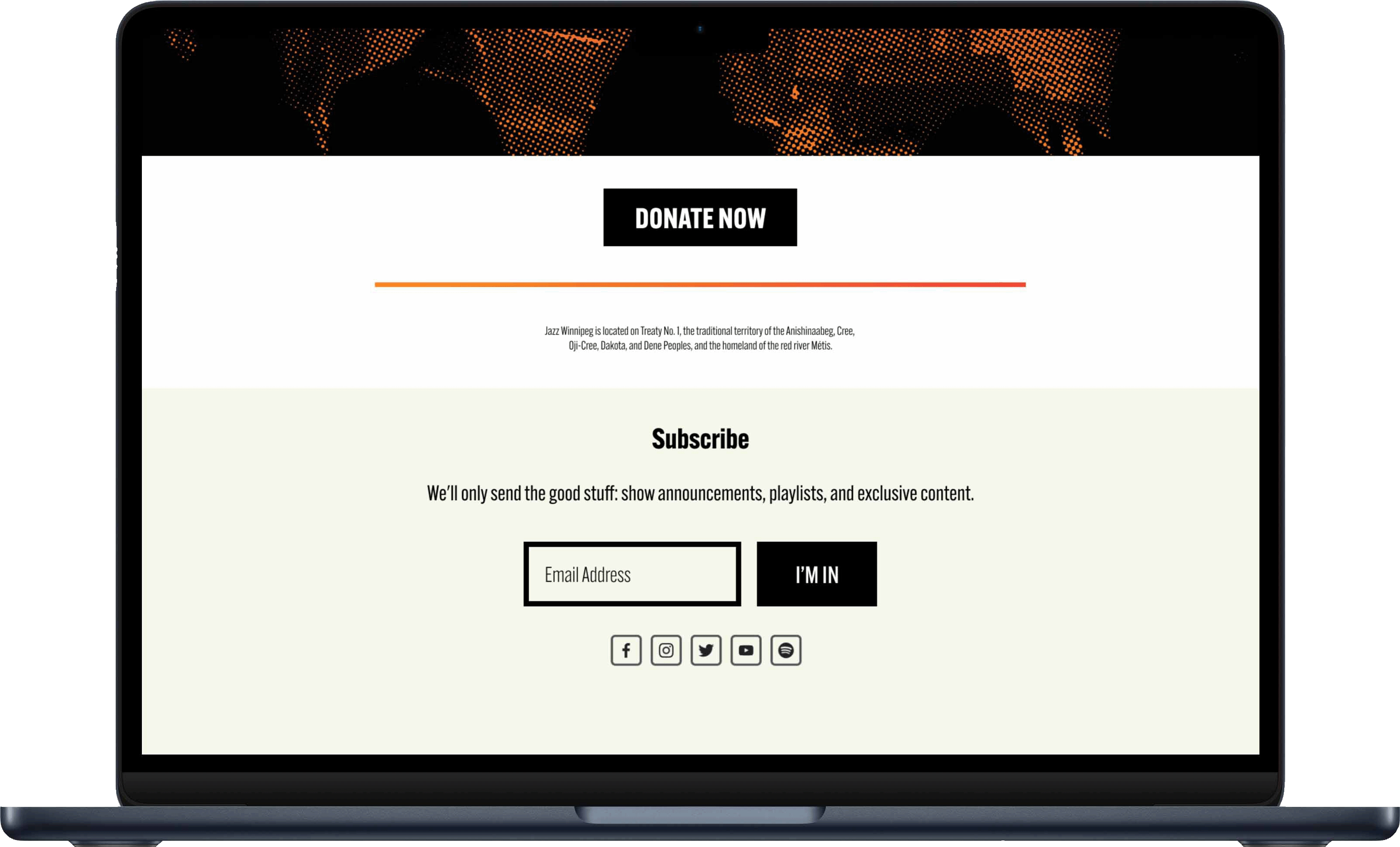
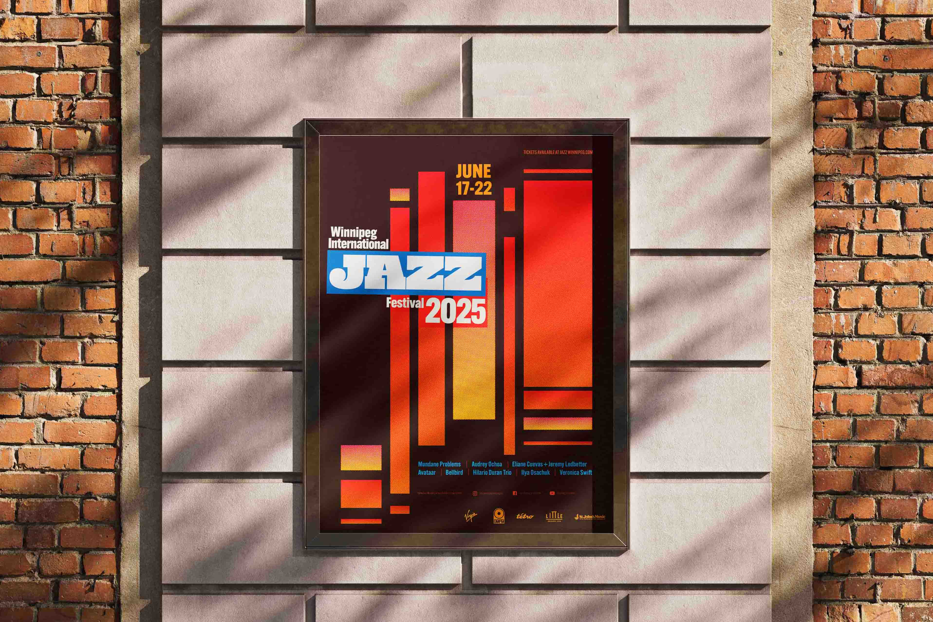
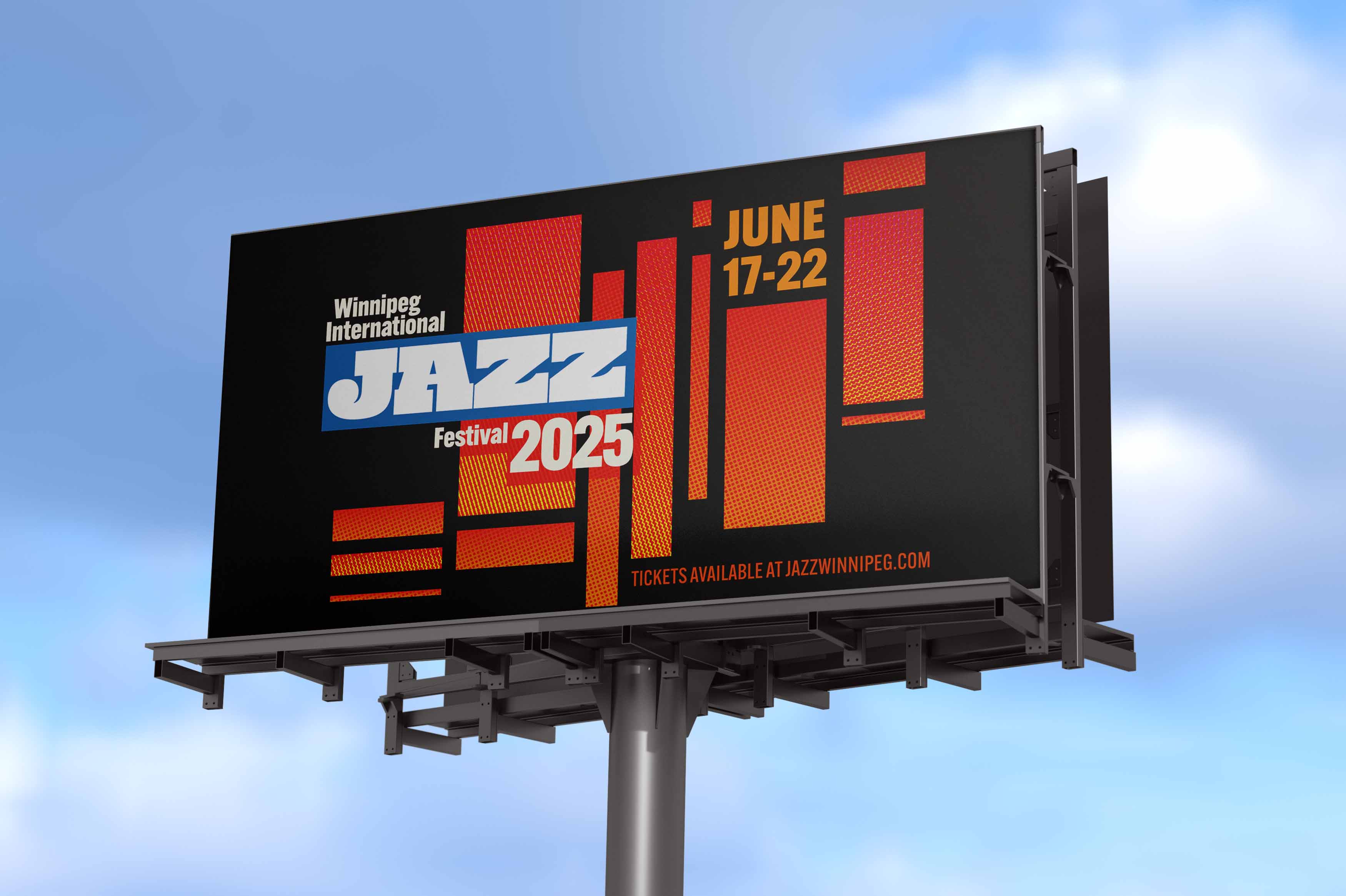
The goal of this project was to unofficially rebrand this years 'Winnipeg International Jazz Festival' with new event posters, a website, social media posts and other expressions. I wanted to take a different direction with this years design while still taking inspiration from prior Jazz Winnipeg designs and classic jazz record covers.
Problem
The problem was finding a design that would align well with my target demographic. I found an official document from Jazz Winnipeg that stated they wanted to appeal to a younger demographic so I decided to attempt that goal with this rebrand.
Solution
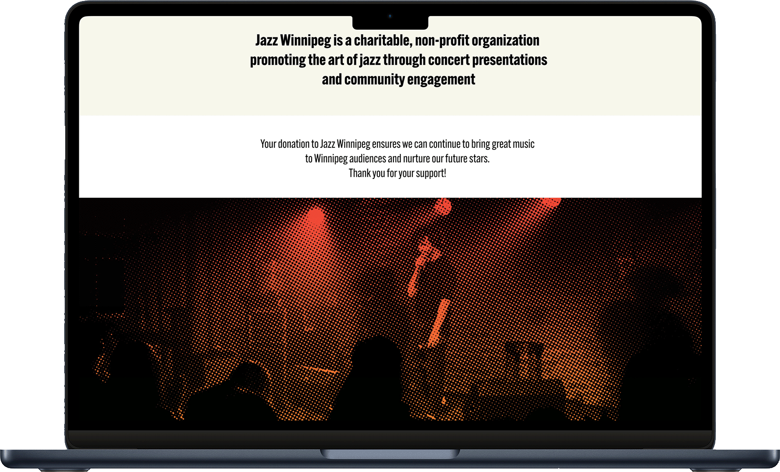
To appeal to a younger demographic I decided to go for a warmer and more saturated palette over the classic bluenote jazz cool colour schemes. The theme graphics are made up of rectangles varrying in width and length that represent the vibrations and variations of jazz music. The theme graphics and image treatments use halftone patterns and a saturated gradient that I felt was eye catching and would grab the attention of younger music fans.